A Beginners Guide to Heatmapping
What is Heatmapping?
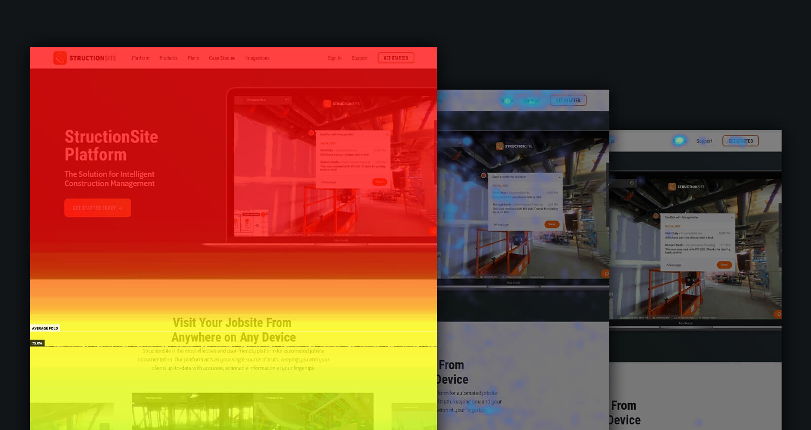
Heatmaps track the user behavior on an individual page of a website and translate that data into a visually-engaging, easy-to-understand graphic. By understanding how individuals interact with a page, we know what works and what doesn’t. Armed with those insights, we can expand what works, remedy what’s failing, and ultimately, create a more effective digital experience.
There are many heatmapping tools out there, most at a similar price point. Our go-to heatmapping tool is Hotjar. When deciding what heatmapping tool is right for you, there are a few factors to consider:
- What individual maps does it record?
- What is the monthly/yearly cost?
- How many projects can run simultaneously?
- How many users can be recorded in a single test?
- How easy is the platform to use?
- Are the maps easy to present to others?
Hotjar’s answers to all of these questions align with our needs as an agency. However, there are no wrong answers when choosing your tool. We’ve used most on the market and, for the most part, have not been disappointed.
Now, onto the individual heatmap types and what they should mean to you. We’ll be discussing three key maps we analyze when improving client websites: Scroll Maps, Click Maps, and Movement Maps. We’ll be discussing these in the order in which we analyze them.

Scroll Mapping
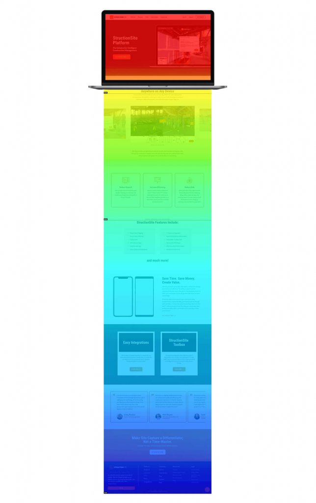
You’ll be unsurprised to learn that a Scroll Map displays, through color-coding, how much of a page’s vertical real estate users are actually reaching. It presents this data in the form of a percentage.
Fading from red at the top of a page (which all users see) to deep blue when the user percentage is roughly 20%, to grey if no users made it to a section of the page, this map is useful for many reasons.
We analyze it first because it is the fastest way to understand what parts of a page are being completely ignored. Before making any content changes, this is something we must know. One of the most common ways to optimize a page is to swap content sections and adjust the hierarchy, but we first need to know if users are even seeing the content in the first place.
Here’s a practical example: you have a button pretty far down on your page that, when clicked, takes a user to a contact form where they can reach out to you and become a lead. However, the button isn’t being used nearly as often as you’d like or expect. There are a few reasons this could be the case:
- The content on the page isn’t compelling enough to generate a lead.
- The text on and around the button isn’t clear about the next steps.
- Users aren’t seeing the button at all because it’s in a part of the page that few are actually reaching.
The one of these three options you want to eliminate first in Option 3. It has nothing to do with the actual creative direction or strategy of the page, the page is simply too long for the attention span of your users. If you shorten the page or just move the button up the page, and users still are not clicking it, you can then move on to addressing Options 1 and 2 through additional analysis.
Scroll Maps can only tell you how much of a page is being seen, not necessarily how much of a page is being interacted with. For that, we move on to the next heatmap.

Click/Tap Mapping
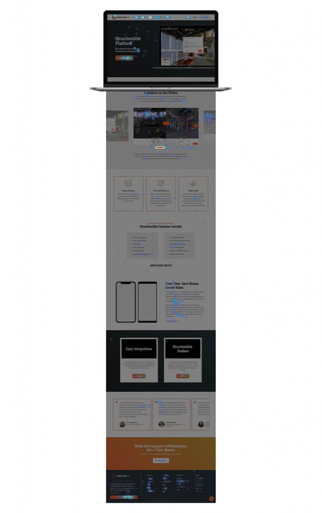
Click Maps are what most people think of when they think of heatmapping. A Click Map looks like a darkened version of a website page with pops of color (or heat) representing areas generating cursor clicks. The more clicks, the brighter the area. The fewer clicks, the bluer the area. If there are no clicks, it’ll appear gray.
One thing to know about Click Maps is that they don’t just analyze buttons or parts of a page designed to be interacted with. Any part of a page can be clicked, which brings us to the first way we use Click Maps to analyze behavior.
Before looking at which buttons or interactive elements are driving the most engagement, we look at all areas of a page driving clicks. What we’re looking for are click hotspots that are not on a button or interactive element. While we certainly want our meticulously-placed buttons to be bright with engagement, we DO NOT want clicks on un-clickable elements of a page.
If you see many clicks on something that isn’t interactive, you have a problem. Most likely, you’ve accidentally designed something that looks like a button to some users but isn’t. More often than not, it’s because of a text treatment that inadvertently looks like a hyperlink or boxed text that inadvertently looks like a button. When optimizing a page, we always start by addressing these accidents.
With that out of the way, we can take a look at how users are interacting with the items we actually want them to click. Start at the top of the page and work your way down, experiencing the page exactly how a user would.
The first question to ask yourself is this: are all of your navigation items being used evenly, or is there one nav item that’s head & shoulders above the rest? For most non-homepage pages of your website, there should be one or two key next-step pages. If your navigation is illuminated equally, the user path may be more vague than intended. Consider adjusting the actual page titles in the navigation, or the order in which they appear.
Now, let’s move down the page. When designing a website page, you are creating a hierarchy of content, leading with high-level information and the differentiators that mean the most to your users. These high-priority content blocks should be paired with the next steps you most want a user to take.
So, when looking at a Click Map, you need to compare buttons to each other. Are your highest priority buttons being clicked most often? If not, why not? Without knowing the specifics of your site page, it’s difficult for us to answer that for you. But, for example, if your third most important button has the most clicks on the page, you need to take action. You can either move it up the page to a place of greater prominence, adjust your more important buttons to generate more clicks, or reconsider your assumptions about the user journey of your website.
Click Maps make all of this possible. But, clicks are not the only way users interact with a page. After looking at scrolling behavior and clicking behavior, we then consider where users are moving their cursors around a page, regardless of whether they click anything.

Movement Mapping
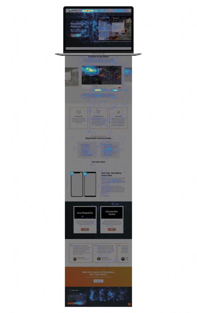
The final map that we look at, which is specific to desktop users, is Movement Mapping. This tracks where a user moves their cursor around a website page, but doesn’t consider clicks or anything like that.
After understanding how users are scrolling and what users are clicking, looking at their cursor movement is really used to make sure nothing has been missed. That there aren’t interactions happening that you wouldn’t have seen through other maps.
These interactions can include where users are highlighting text, which older users in particular often do while reading. Users also hover without clicking on certain items when trying to understand if they’re live links or not, so there are Click Map-esque insights to be gained here as well.
More than anything else, you’re looking for cursors to move logically from content item to content item, without losing their way on unimportant areas of the page. Of the three maps we analyze, Movement Maps offer the fewest insights but do confirm previous assumptions.
Other Tools
An important note is that you can’t make definitive assumptions about user behavior and shouldn’t make high-impact page changes after ONLY consulting heatmapping. A heatmap tells you how an individual page is used, but not how pages are used together.
You need to use tools like Google Analytics to understand how your website is being used as a whole. You need to use search tools like Spyfu and SEMRush to understand how users are getting to your site and how qualified they are. After all, the way a user is interacting with a site page is useless information if they shouldn’t have been on your website at all. We need to cater to our most qualified users.
The moral of the story is this: heatmapping is a vital tool to have in your toolbelt. There is no better way to understand the successes and failures of a single page of your website. But no one goes into battle with a single tool at his disposal, and neither should you.
If you’re interested in getting started with heatmapping, we encourage you to check out Hotjar and start a free trial today. You won’t be sorry.
