Building Thoughtful Themes
In addition to making huge strides in our frontend capabilities, we expanded the breadth of content management systems we work on. We take pride being a CMS-agnostic agency (more here), and this past year was greater proof of that effort. We’re now designing and building building fully custom sites on a multitude of platforms, and because of that, we have realized the importance of putting as much thought into the selection of the CMS as we do the actual buildout of it.
We build sites that look beautiful on the frontend to get people to convert, but we also need to build out our CMS to function beautifully to make sure that time isn’t wasted trying to locate where to edit important pieces of information. The thing is, simply throwing together a bunch of fields in a CMS without much thought is going to hurt you down the line. Think about it, this is the area were 99% of your edits are going to take place over the lifespan of your (or your client’s) website. Below, I’ve outline four major things to consider when building out your CMS fields:
Labeling field areas with nondescript, generic labels is a recipe for disaster. Just like assigning relevant names to variables in code, we want to make sure that field labels are specific enough to be meaningful while still maintaining a certain standard of brevity. Make sure your labels inform users of two things: what the content is and where the content appears. If your label addresses these two items, chances are it’s a going to do the job.
Section Fields Whenever Possible
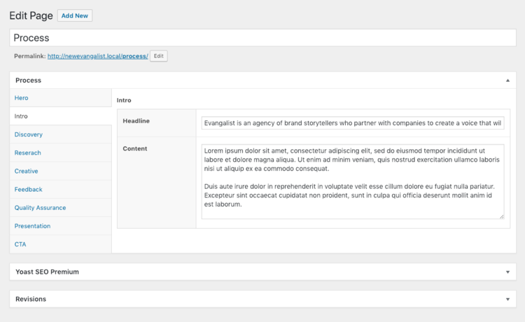
Your options will vary based on the CMS platform, but there is usually always some kind of tool that allows for the organization of fields into different sections. For WordPress, I love using ACF Tabs. By segmenting information, you inherently build hierarchy and structure to the storage of fields in your CMS. Shopify also has great options for sections and blocks to help keep the values stored in the theme settings schema organized.

Change Your View
The quickest way to figure out if you’re building a CMS out in an intuitive way? Pretend you don’t know anything about web development while you’re doing content entry. I always err on the side of caution when selecting field types, especially when it comes to selecting the field type for an area of text. Most CMS platforms offer a textarea and rich text (WYSIWYG) field for longer blocks of text. Unless the user needs total control over the content being entered, I use textareas. This keeps the content free of extra characters or irrelevant code tags that carry over in a copy & paste.
Finally: KISS
In other words, keep it simple, stupid. It can be just as detrimental to overthink things as it is to not think about them at all. Give users as much control over their site in their content management platform as they need, but not more.

So often, developers spend the time perfecting code that goes into a website and forget about the people that will be using it on a day-to-day basis in the CMS. Considering the above items is a great first step in making sure that the next website you build is easily updatable and understandable, ensuring that admin users can make the most out of their custom website as it grows and the content changes.
