“Do Users Still Read?” Is The Wrong Question
In short, the first reason that “Do users still read?” is the wrong question is because of the word still. Users have never read much content online. The second reason “Do users still read?” is the wrong question is because it’s closed-ended. It only has a yes or no answer. It’s open-ended counterpart is the real subject of this article:
How Do Users Read Online?
Ahh. That’s better. We now have a question that can be researched, debated, and written about. In my view, this question has to be answered in two separate phases, quantitatively and qualitatively. In other words, we need to discuss how much users read in terms of percentages and scrolling, then we’ll talk about in what way they read in terms of patterns and content styles. After that, we’ll dive into what content creators and UX designers should keep in mind when writing for website users.
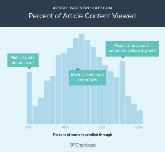
There isn’t one definitive answer to this question. According to Slate in their post, You Won’t Finish This Article, author Farhad Manjoo in partnership with Chartbeat concluded that most users read roughly 50% of articles on the Slate website. For websites not built around long-form content, you see that number drop closer to 20%, according to a more recent Nielsen Norman Group study.

This is a histogram showing how far people scroll through Slate article pages. Each bar represents the share of people who stopped scrolling at a particular spot in the article. (An article is assumed to be around 2000 pixels long; if the top of your browser window gets to the 2000-pixel mark, you’re counted as scrolling 100 percent through the article. The X axis goes to 120 percent because on most pages, there’s usually stuff below the 2000-pixel mark, like the comments section.) This graph only includes people who spent any time engaging with the page at all–users who “bounced” from the page immediately after landing on it are not represented. The graph shows that many Slate readers do not scroll at all. That’s the spike at the 0 percent mark, representing about 5 percent of readers. Most visitors scroll about halfway through a typical Slate story. The spike near the end is an anomaly caused by pages containing photos and videos — on those pages, people scroll through the whole page.
Put another way, according to Crazy Egg (a product we highly recommend) in their blog post The 15 Second Rule: 3 Reasons Why Users Leave A Website, you’ve got roughly 15 seconds including load time to tell users what they need to know. Or at least grab their interest. They go on to note that if your website isn’t visually engaging, you have less time. If your site is thoughtfully designed, you could earn more time. Regardless, just like print journalists, digital copywriters cannot afford to bury the lede.
So what happens to the readers who don’t reach that 20-50% threshold or spend less than 15 seconds on the page? According to Slate & Chartbeat, they fall into two buckets:
1. They didn’t scroll at all.
2. They only looked at photo or video content.
In other words, they did what a young child would do if you handed them a book they couldn’t yet read. Which brings us to our second question.
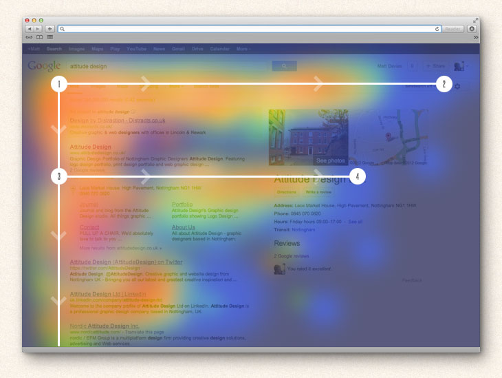
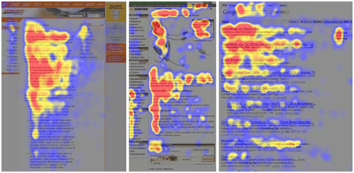
The F-Pattern is a widely discussed user experience design reality that quickly explains how users scan content. They start in the top-left of the page and read to the right across the main headline. Then they go back to the left and skim down the page until they reach another subheadline before returning to the left-hand side to continue down. The only thing that breaks this pattern is when they reach a visual element or a video.
 Image Courtesy of arielbeninca.com
 Image courtesy of instapage.com
In other words, users fly down a page until a particular line catches their eye. These stops-you-in-your-tracks pieces of content typically include:
- Headlines
- Brief Subheadlines
- Bolded Content
- Bulleted Content
- Content On Images
- Linked Content
As UX Magazine says in their article The F Pattern: Understanding How Users Scan Content, studies show than leaning into this user behavior rather than fighting it can result in the usability of your website increasing. The argument against this thinking can be found in articles like this one from the Nielsen Norman Group, which states that with the growth in the prevalence of mobile-responsive and liquid-text layouts, the screen size of a user directly impacts what non-headline content they’re going to be scanning. Put another way, the amount of different devices your users utilize means you can’t plan for them to skim your content any one way.
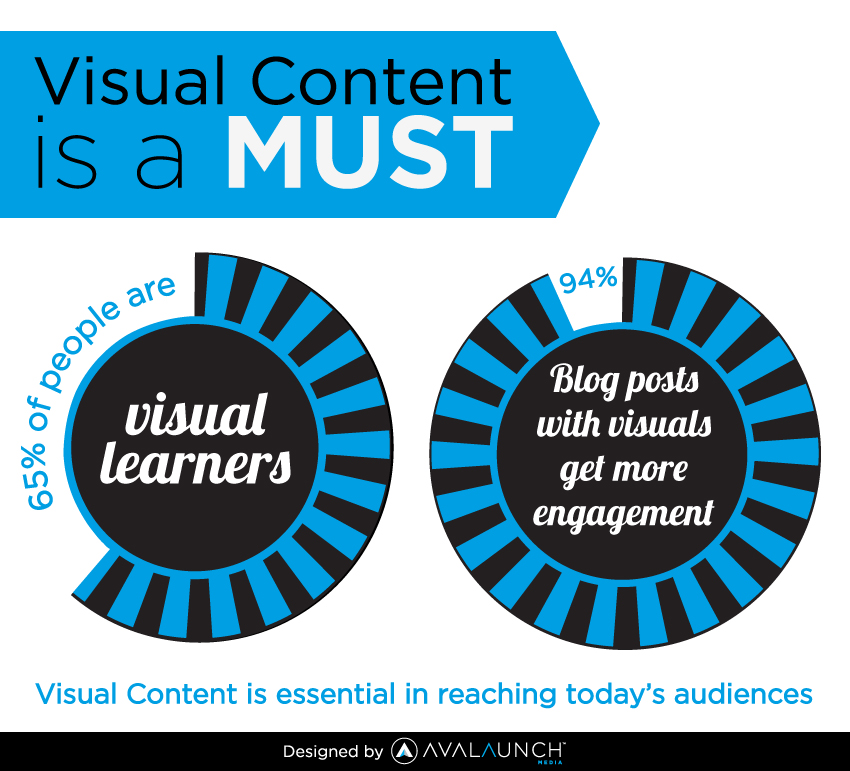
The remedy to this problem is visual content, which breaks the F-Pattern. We won’t belabor this point, everyone loves great imagery, infographics, and video. Put numerically, according to Crazy Egg, 65% of website users are visual learners and blogs with visual content get 94% more engagement.
 Image Courtesy of Avalaunch Media
Need more proof? According to a study by The Aberdeen Group, businesses engaging in visual content tactics online can see an 83% increase in annual revenue, 8-times the customer retention, and twice the conversion rate of businesses that rely solely on text-based content tactics.
Now that you’re up to speed on how users engage with written content, and potentially are depressed about these facts, there is one big question left to answer.
“Where Do We Go From Here?”
Answer: Write Like A Journalist & Incorporate Visual Content.
There’s a reason that most folks with a degree in advertising earned it through their university’s School of Journalism. Journalists are taught to write in a very particular way. Converted to website copy terms, the key lessons are as follows:
- Lead with brief, impactful, and straightforward headlines.
- Make sure your reader learns something within the first paragraph.
- Use subheadlines that are meaningful and eye-catching.
- Lean on visuals to maintain interest and explain complex topics.
As UX Myths points out, concise, scannable, and objective copywriting can result in 124% better usability. They also note that when content isn’t easily scannable, only 1 of 15 tested users could quickly locate a specific piece of information.
Presumably, a user on your site page is there because they are interested in the topic of the page. But, no matter how interested they are, they’re going to skim the content. Use your headlines, subheadlines, and bolded content to guide them to the content that actually matters to them. Your non-body copy is an informative map guiding them to the meaty content they actually want to chew.
Lastly, USE VISUALS. Even if your visual content is restating what’s already present in the written copy, it’s still infinitely valuable. Your page should be compelling and make sense if the user only reads the headlines and looks at the visual content.
Let’s Test Our Theory.
If you just jumped straight to the end, we just made the assertion that a piece of digital content, no matter how long, should make sense and provide value to a user who only read the headlines and looked at the visuals. In other words, it should be impactful to users reading in the F-Pattern.
Go back and read this post that way. Does it make sense? Here are the headlines in order:
- “Do Users Still Read” Is The Wrong Question?
- How Do Users Read Online?
- Question One: How Much Do Users Read Online?
- Answer: 20-50%, But Only If You Grab Them Within 15 Seconds.
- Question Two: In What Way Do Users Read Online?
- Answer: They Skim In An F-Shaped Pattern & Look At The Pretty Pictures.
- Question Three: Where Do We Go From Here?
- Answer: Write Like A Journalist & Incorporate Visual Content.
At a high-level, there are lessons there. This is a 1,300-word post that can be skimmed successfully in about 10 seconds.
If a scanning reader wanted to spend closer to 30 seconds on this blog, they could also read the first paragraph or so and look at numbered & bulleted content, thus adding even more value.
Lastly, if a reader is looking for information about a specific piece of this article, maybe how long you have to grab a digital reader’s attention, there is headline, bolded, and linked content guiding them directly to it and linking out to a website with more info.
A Concluding Clarification.
Though the data-based recommendations we just discussed are based on the behavior of millions of online users, they’re not going to ring true 100% of the time. Your business and your users are unique, so we highly encourage you to do research of your own! That’s the only way to know how your users are reading your content. If nothing else, use Google Analytics. It’s free.
If you just aren’t data inclined, at least produce content. There is absolutely no reason not to. Content is still king and that reign won’t be ending any time soon.
