Five Typography Trends of 2018
1. Serif Fonts
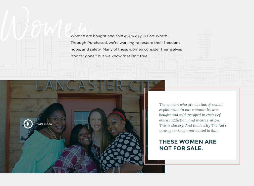
Serif fonts are rapidly rising in popularity in comparison to sans-serif fonts. In the digital space, they are increasingly popular when used in tandem with a sans-serif font. These pairings are surging all over the internet and add warmth, character, and legibility to the websites on which they are featured.
This trend is starting to signal a move away from the stark minimalism of past years. Especially for brands focused on storytelling and human connection, these serif fonts lend a touch of personality and sophistication that deviate from the cold harshness of rigid sans-serif fonts.
2. Retro Fonts
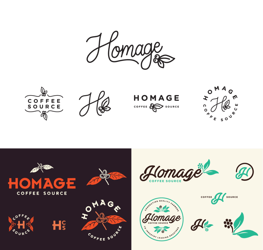
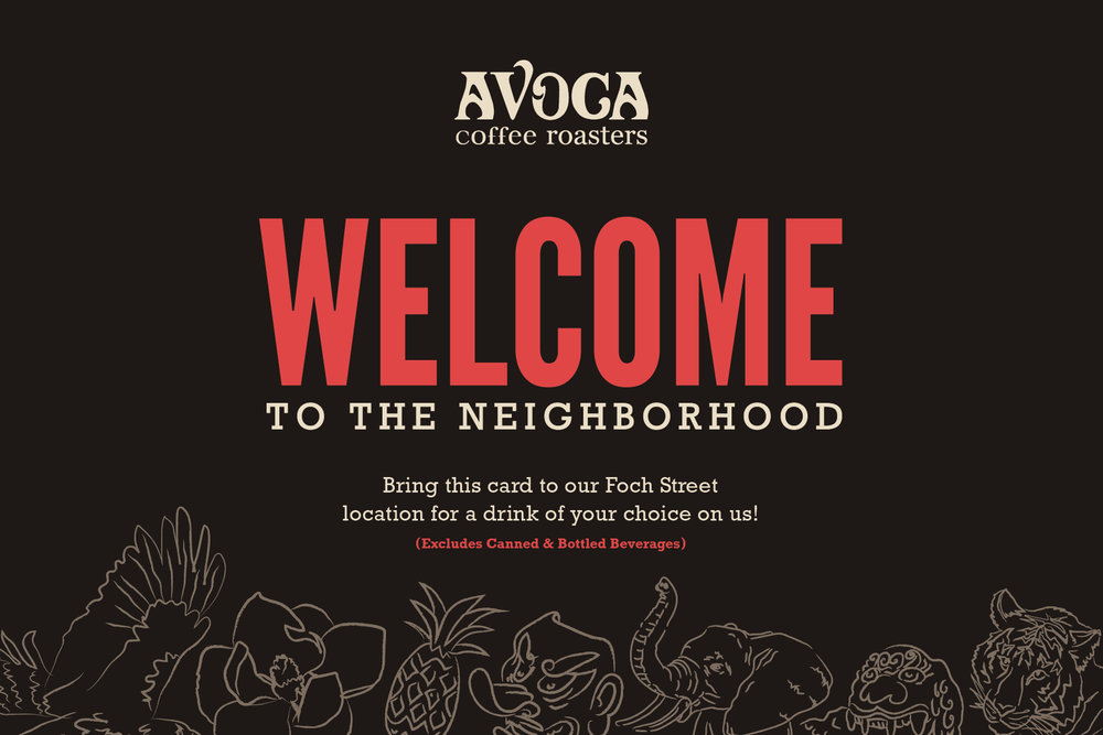
From Mid-Century to Vintage Slab, fonts that transport us to another time have been and will continue to be popular. We have seen this resurgence as an homage to a simpler time with classic appeal. ’70s style serifs and scripts have been popular as businesses search for a way to communicate that they are ‘artisanal’ or ‘fun’ while remaining contemporary and clean. Either way, the goal here is for brands to find a way to show character and stand out.
3. Custom Fonts
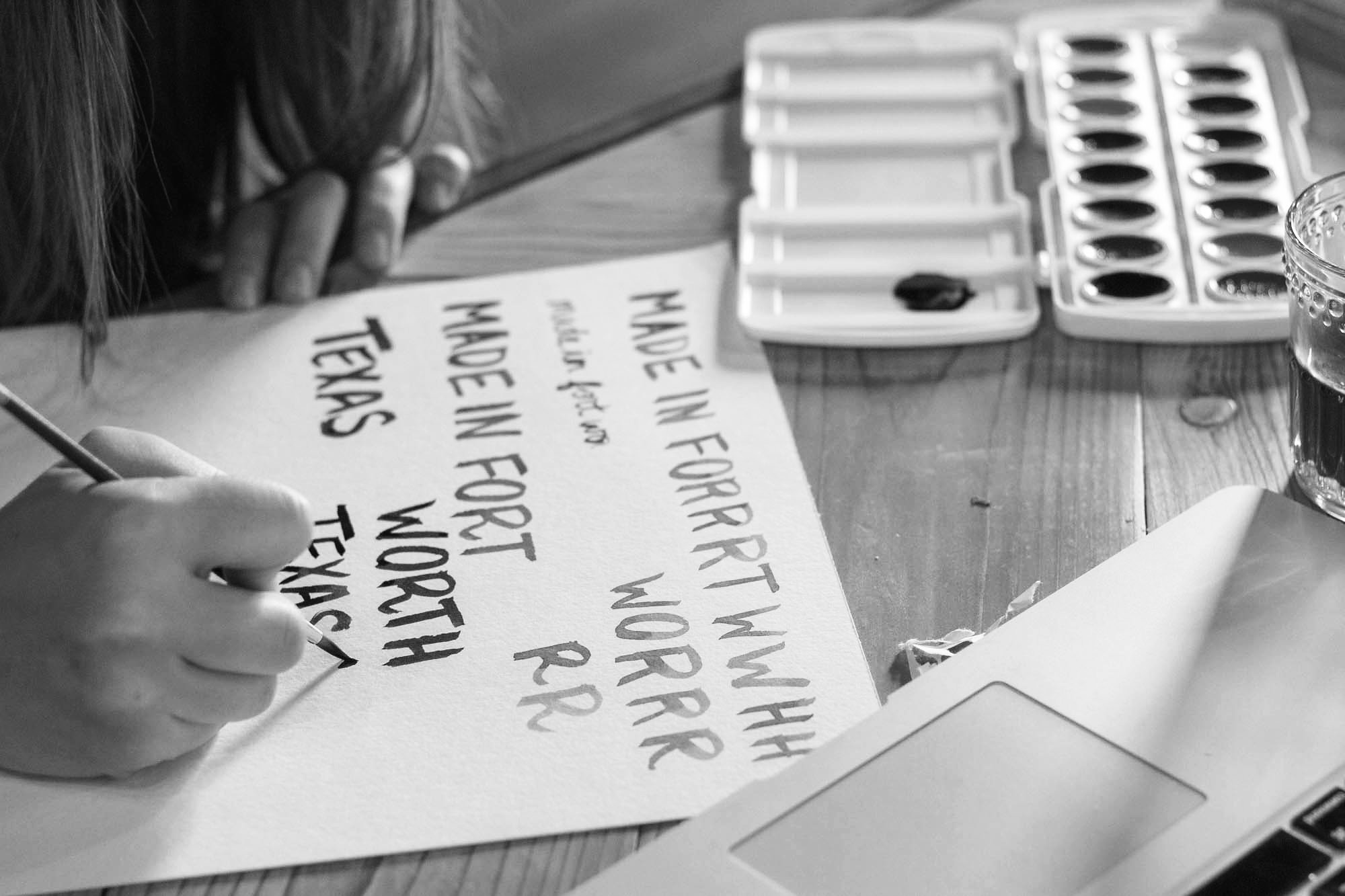
Another way to say custom is just handwritten. We have seen this rising in popularity as brands again search to be seen as a personified character with emotions and traits their human consumers can identify with. While large chunks of text in custom lettering are obviously not popular; logos, posters, and book covers have all taken advantage of this trend. Not all popular customized type is handwritten, as some customization goes only as far as tweaking an existing typeface with simple adjustments to give it a personal feel or fit it better into a particular design.

4. Highlighted Type
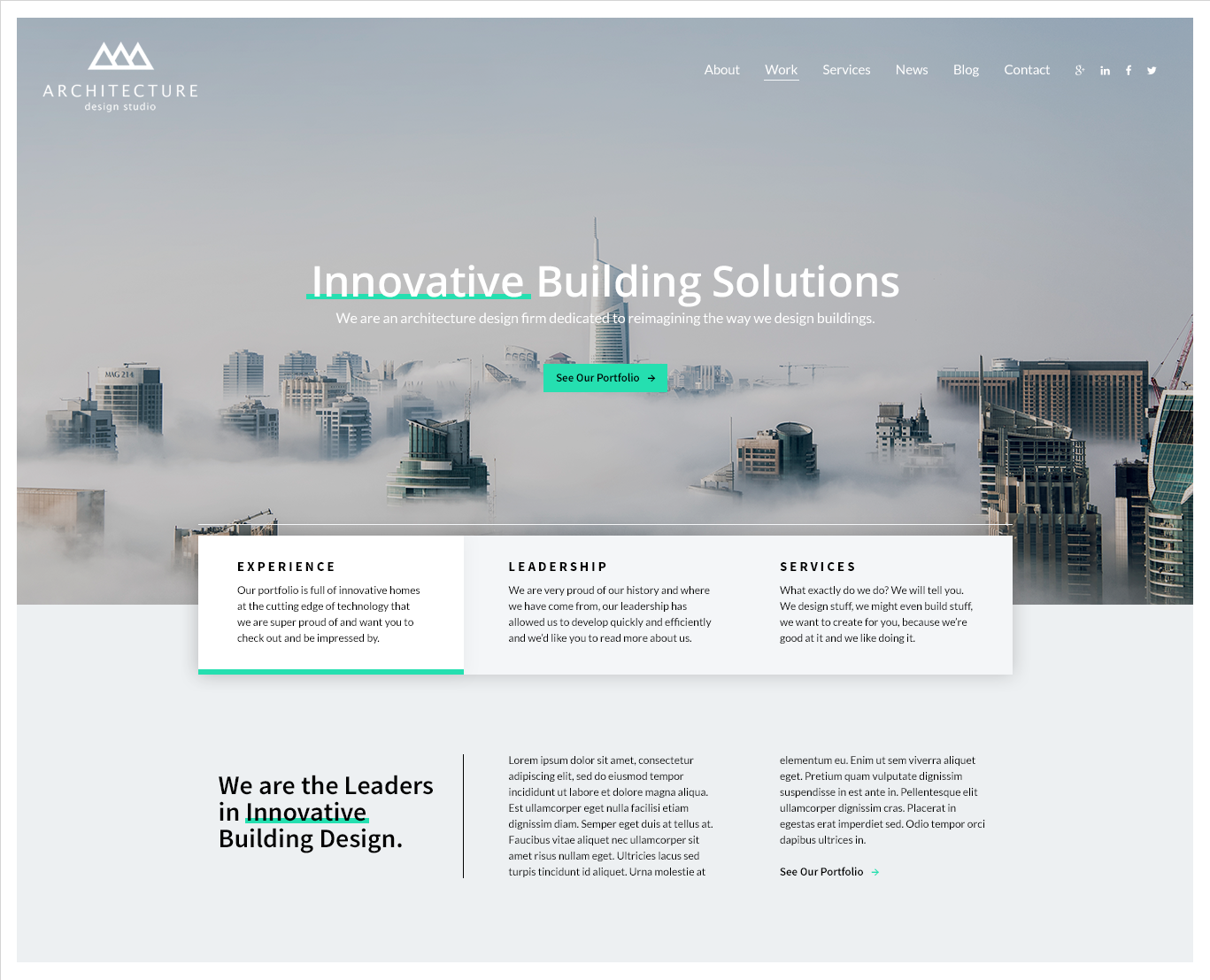
This styling can be applied to any typeface but is popularly used on the geometric, bold, sans serif type still largely popular across all web design. Adding this element assists in building the character of what is now a ‘standard’ web type. Highlighted text is used to separate words from a background, whether half behind like an underline or fully flush top to bottom. Visually, it’s incredibly engaging, but works best on short blocks of text. If it is overused it can become overwhelming and detract from the overall design.
5. Color Type
This may come as a shock to you, but text doesn’t have to appear in black. Okay, okay, this isn’t groundbreaking but for some reason this year everyone is pretty pumped about text being in color. From gradients to cutouts & overlays, playing with color on type is definitely a trend. By adding color and styling to typography, designs become animated and dimensional. Gradients create movement through the type but need to be used sparingly to create the largest impact. Cutout typography works best on a photo or video where the ‘fill’ of the text is the image itself, but still remains legible (this works best if text is large and short). Finally, overlay text is simply lowering the opacity, and works best over a simpler background and in a situation where the text isn’t the most important aspect of the design.
Conclusion
Even though this is a year of character-driven fonts, the geometric sans-serif typefaces continue to dominate the typographic landscape. We will see the trend toward these five stylistic directions grow as designers continue to search for ways to push boundaries and create distinctive works of typographic art, but I don’t think we will ever fully stray from our old standbys (hello Helvetica and Gotham). Whether you love them, or love to hate them, they are here to stay. I’m just pumped about how these trends are dancing with character around them.
