Let’s Design A Landing Page
Write Some Killer Copy
Most of your audience isn’t going to read the fine print, they are going to skim – so you gotta have eye-catching headlines. Make them easy to understand, with a straightforward proposition value. Use simple and specific language. I know I just said people don’t read, but the goal is to get them to, (and hey, you’re reading this, aren’t you?) in your body copy you need to be convincing, back up any claims you make. Check out our Do Users Still Read blog to learn more than you want to know about writing solid copy.
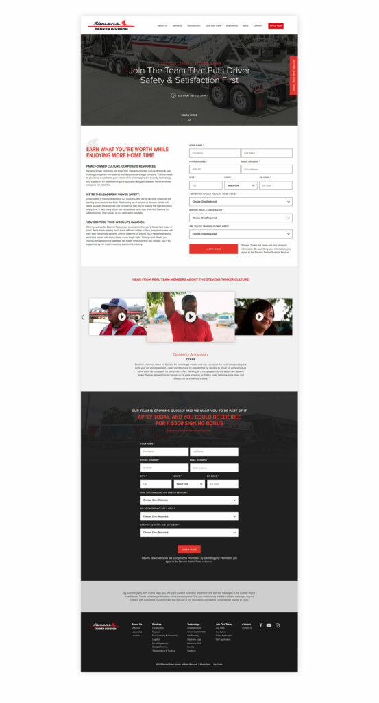
Our Stevens Tanker application landing page hits quickly on the topics a potential recruit wants to see first. Safety? Got it. Satisfaction, guaranteed. But you want a killer copy line? How about “Earn what you’re worth” – that’s a job people apply for.

Call-To-Action
CTAs are a landing page’s best friend. A call-to-action is a direct, compelling request you make to convince your user to take the desired action on the landing page. Engaging with this call-to-action is what we want them to do, so we need to make sure it’s the easiest thing in the world to do. All roads lead to Rome on a landing page, so anything you can click, move, or interact with, it better take them to that CTA. As for the CTA itself, make it as clear & simple as possible. If it’s a form, make them fill out the smallest amount of information you could possibly need. The quicker the user can be done with it, the more likely it is that they are going to fill it out.
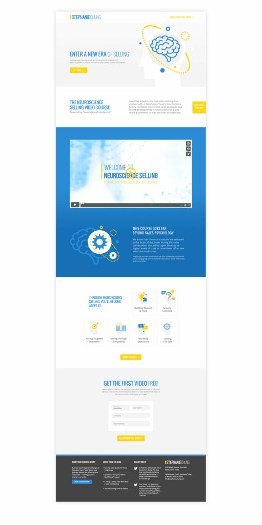
Our landing page for Stephanie Chung’s Neuroscience Selling sales course is a haven of CTAs. At every point of the page, the content is directing you to sign up – plus there is a tasteful little CTA friend following you down the right hand side of the page as you scroll.

Layout + Design
You need it to look good, right? That should be a given. A clean and simple user experience is best, and make sure any navigation matches where they are coming from or going to – consistency is key. The page itself should be as short as the content allows. Keep it short and sweet just like your forms. If your CTA isn’t sticky (aka following them down the page) then terminate your page in your call to action. Make sure your page has a logical structure and you aren’t taking them on a hurt for buried treasure.
Also, just because your landing page might not be part of your main marketing website doesn’t mean you get a pass on brand standards. If a user doesn’t convert on your landing page, they may come back later and visit your main website. If they don’t look similar enough, they may not know that you’re the same brand they met before. Worse, if they know your brand well and the landing page doesn’t align with it, they may fear that they’re trying to be scammed out of their personal information.
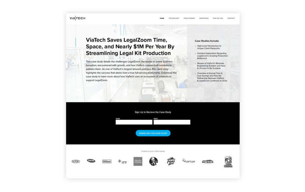
This simple case study request page flows seamlessly with the Viatech website, and terminates quickly in an easy two-step form fill.

Mobile Responsive – duh.
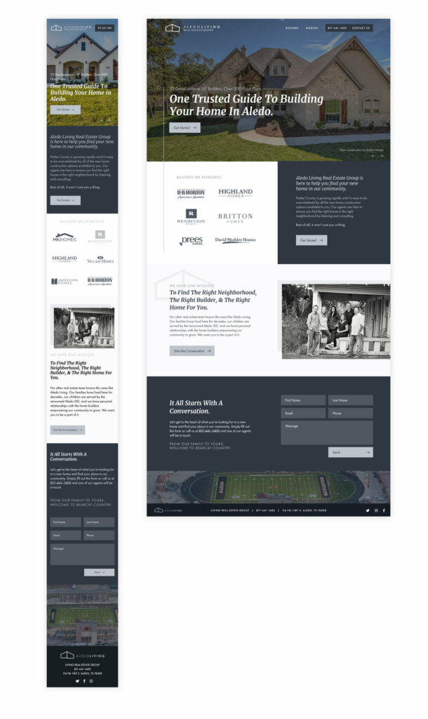
We’re just going to clearly lay this out. Most people are on their phones. They are likely clicking on an ad from a social account, and for heaven’s sake, your landing page NEEDS to be mobile friendly. You’re smart. You know this. We won’t insult your intelligence further. Here’s an example:

Target Your Audience
We’ve saved the best for last, even though it’s the step that should come first. If you mess this part up, the world’s best landing page can’t save you. Make sure you have a crystal clear picture of who the target is for your landing page. Realistically, it should be the exact same target as the ad, email, or whatever other avenue your potential customer took to arrive to it. And before you say, your target audience isn’t everyone. Unfortunately, it just isn’t that simple or easy. So…
Tailor your messaging. Tailor your imagery. Serve that target audience. If need be, you can even create multiple landing pages tailored to specific audiences. The more specifically you can identify your product or service with a specific person, the more they resonate with it, and the more likely they are to convert. All any of us want is to be understood, and the basic principle of any landing page is to tell your audience that you understand them. You see their needs, and you are here to meet them.
