Our Favorite Websites of 2017
We’re nearing the end of 2017, a monumental year for the General Public team. We’ve written extensively about how these twelve months have treated us as a company, but now we want to review some creative high-points that exist far outside our four walls. General Public has launched websites this year that we are extremely proud of, as you may have noticed from our social media feeds, but we decided to each choose our favorite non-General Public sites of 2017. Each of these sites accomplishes something different, comes from a different world, and proves how eclectic web design really is. Our choices also showcase our individuality in a way, and are written in our own words.
Sam Fleming | Design
Hipcamp.com
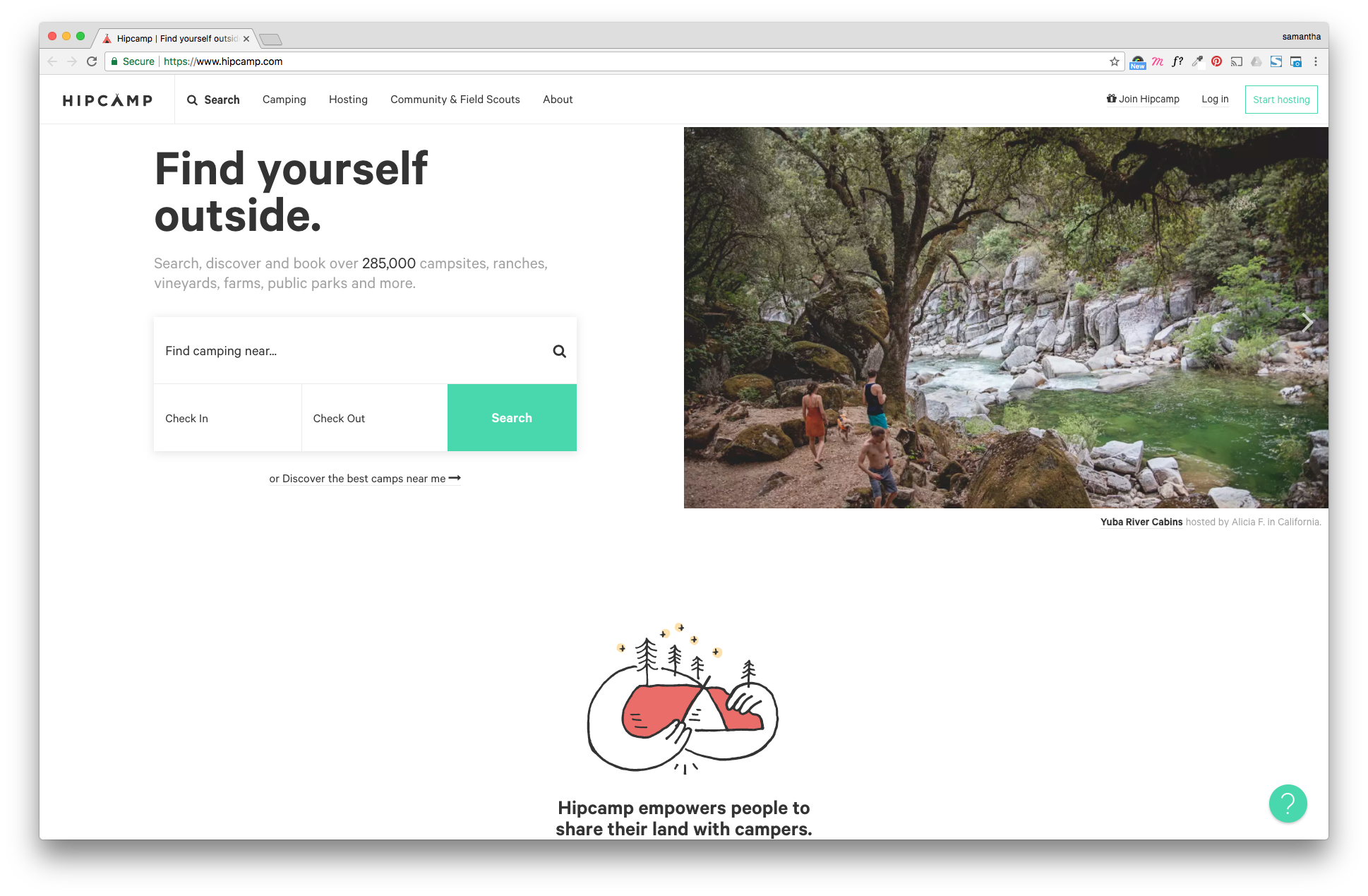
My super cliche choice for my favorite site of 2017 is Hipcamp, a hipster knock off of Airbnb for camping. Before you judge me too hard, just look at it.
The top five reasons I love this site:
- 1. I’m a sucker for good illustrations.
- 2. “Clean Design” = great use of negative space and simple typography.
- 3. MAPS.
- 4. It’s like Airbnb but for the out of doors.
- 5. Somehow everyone on here takes beautiful photographs.
Okay but seriously, outside of the shallow reasons why I love this site, it truly is incredibly easy to use. Pages are long, but full of intriguing content. The details important to the user are not overlooked (what’s the weather in this location today, for example). And okay yeah, number one it’s pretty. But for a site with this much functionality (again, that map page, are you kidding me?) to be as clear and easy to use while retaining site speed and not feeling cluttered in remarkably impressive. Realtor sites need to take note, because this is how it’s done. If you’re even remotely outdoorsy (they have everything from farms to upscale cabins) I highly suggest you check out this site. It also gets bonus points for all the dog pics.
Spencer Merryman | Media
Adultswim.com/Music/Singles
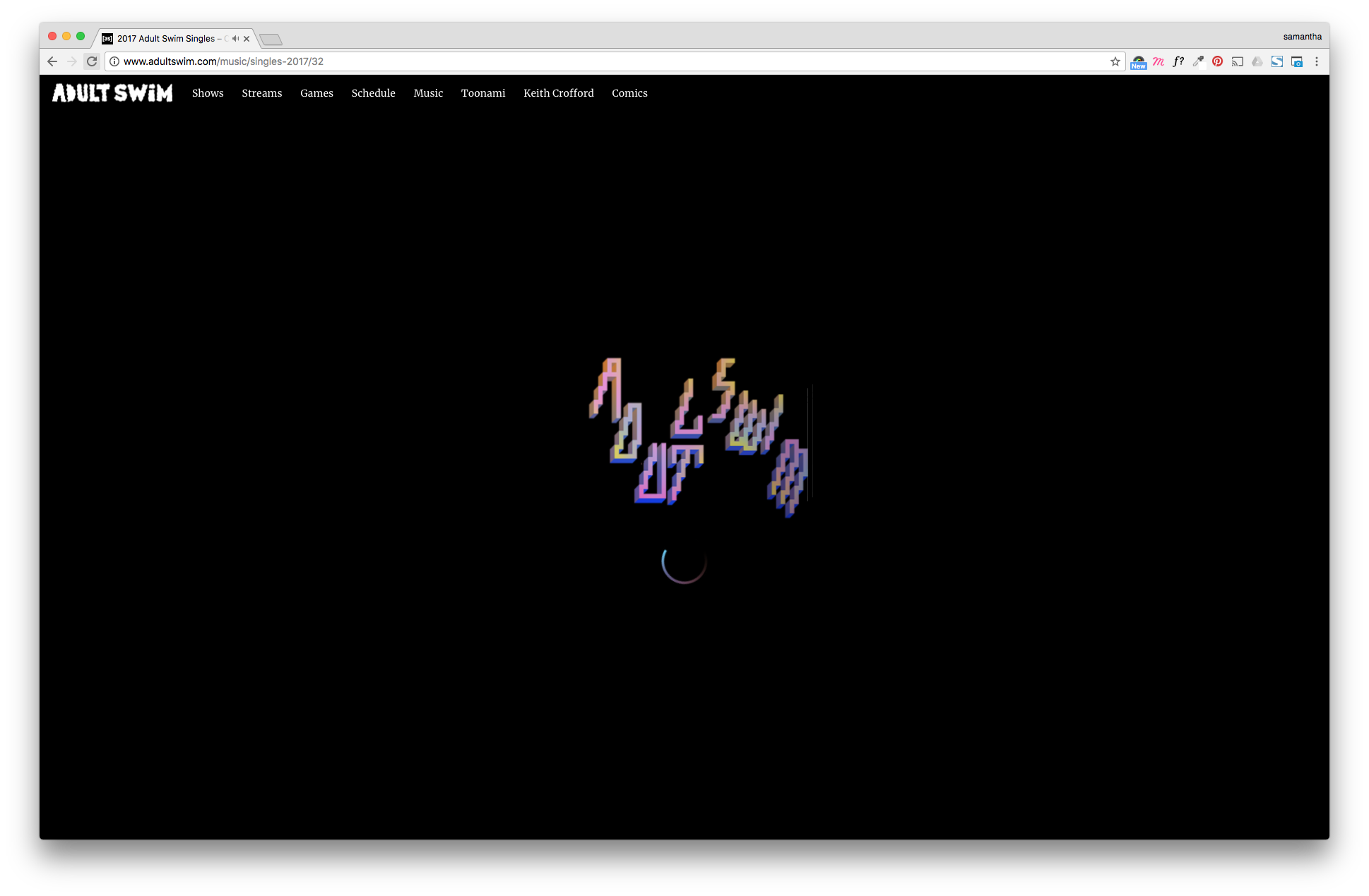
My choice for my favorite website of 2017 is the Adult Swim Singles site. For those of you that know me, you are probably groaning and rolling your eyes right now, but I’m telling you, this site has legs. The user experience is very minimal, no scrolling up or down, or even side to side. It is just a static page that is interactive and plays music. The interactive part involves being able to manipulate the motion graphics as the song plays, which is a fun way to fidget if you’re super antsy like me.
One thing that I absolutely love about this site is that the UX essentially forces you to listen to the first 30 seconds of every song. For me, I typically decide on whether or not I like a song within the first 15 seconds. This site has proven to me that I’m being too hasty with how I judge songs.
Another reason I like this site is that they release a new single every week (which means 52 songs a year for those who don’t know how many weeks are in a year). Now not only is this a great way to discover new music, but it also creates a platform for musicians that might be overlooked otherwise. I have been finding all of my new music through this site for the past year and have loved every song so far.
Anyway, here’s Wonderwall. Go check it out, listen to some tunes, and enjoy yourself.
Joey Swindle | Co-Founder
HuluLive.com
So, as a 37-year-old father of 2 and business owner, I don’t have much time at all to browse the web. When we decided to create this blog, I knew I was going to struggle to come up with a favorite site. To my surprise, it didn’t take me long to nail down my choice. It’s not nearly as cool or interesting as the other team members’ choices, but I realized that I personally have been served really well by Hulu’s new Live TV website. I’ve noticed that most media companies in their space (i.e., Netflix) take little care to create a quality landing page experience for their customers. They just throw up a sparse cover page for their web-app with little info, which can make it difficult to navigate if you’re looking for information rather than just immediately viewing their media.
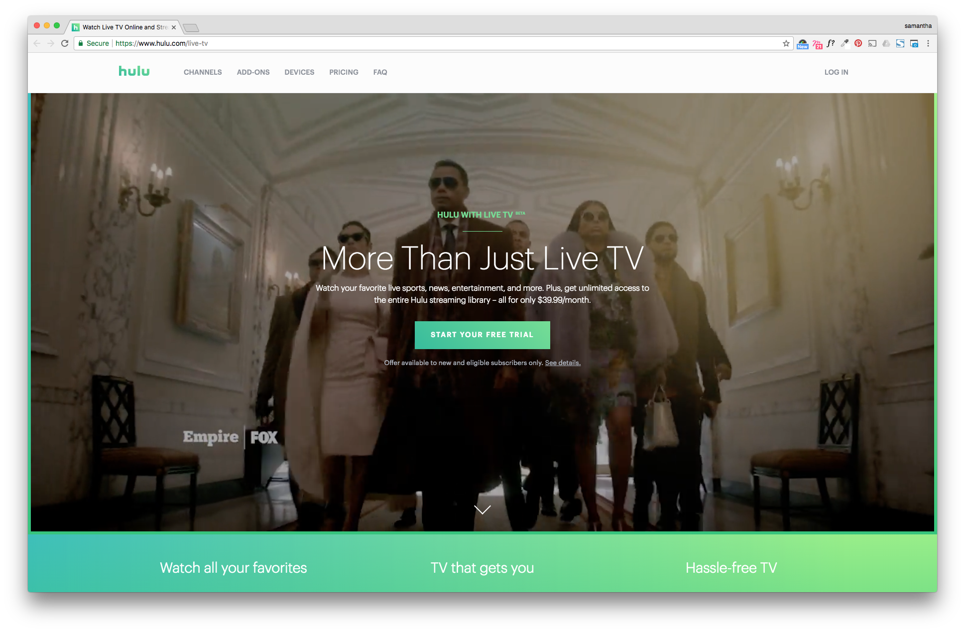
Hulu’s Live TV site greets you immediately with an engaging background video and a very clear “Manage Account” call-to-action, preceded by concise and informative marketing copy that makes you want to learn more. They follow this area immediately with three vignettes featuring education on Channels, Devices, and Pricing- clearly the three items that I would assume are the most important to any consumer making a decision. After passing through an excellent visual depiction of the channels they offer, you encounter three consecutive blocks of copy and images in this order: Sports, News, Cartoons. As alluded to previously, for me as a 37-year-old father of 2 and a business owner, Hulu couldn’t have prioritized those pieces of content any better for me. After this, they remind you that you also get their well-known streaming services most of us already use, premium channels you can add to your account, and which devices you can view live programming on. Wrap that all up with some helpful FAQ’s (always crucial for any new service) and I’m not sure what else you could ask for.
By the way, I’ve been using the new Live TV service for a couple of months now, and I really like it. At $40 per month, I consider it a monster value. They’re doing a really superb job on the app interface, and I keep seeing updates in the app that are solving the minor problems I’m finding as I use it. Hulu, the Swindle family salutes you.
Jon Cannon | Co-Founder
Issa.website
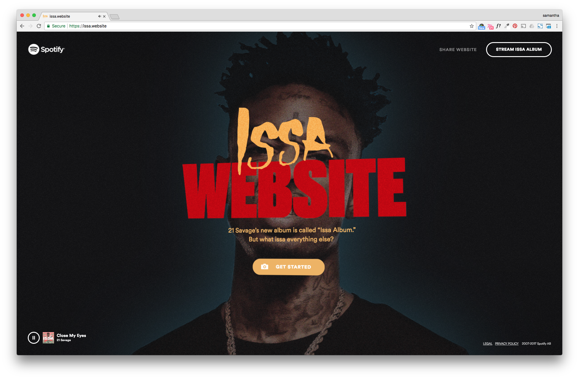
I almost feel like I’m cheating here because this barely counts as a website in the traditional sense, despite its name being pronounced ‘Is A Website.’ This landing page-esque, app-like web thing is a collaborative effort between music streaming giant Spotify and rapper 21 Savage, promoting the latter’s new album, Issa Album. Before I get into why I love this weird concoction, I need to explain what it actually does. Issa.website is an interactive experience that uses machine learning to scan a picture you take or upload, then tells you what it is. In 21 Savage’s voice. With the word ‘Issa’ in front of it. Presented in a meme-like format. You really should just give it a try before we proceed. Oh, and 21 Savage’s album is being streamed in the background for the duration of your time on the site.
Okay, now that you’ve had time to experience the wondrous joy of this website, I want to talk about why I love it so much. The digital currency that young people (21 Savage’s target demo) use every day is rapidly produced, disposable, repetitive, passively humorous content. That’s exactly what this site creates. When I shared this link with the office, I heard my coworkers’ faint chuckles at the website itself, and at themselves for finding the site entertaining. That response is not unlike what you hear when someone is scrolling through Facebook or Reddit. Spotify and 21 Savage’s understanding of today’s cultural zeitgeist is right on the money here.
So looking at this thing from a higher level, we have an up and coming artist partnering with an industry behemoth and using remarkably nuanced machine learning technology, all to create something utterly meaningless – the soundtrack of which is the product that’s actually being promoted. It’s a snapshot of internet culture in the best and worst way, and for that reason, it’s my pick as my favorite website of 2017.
Liz Bryson | Development
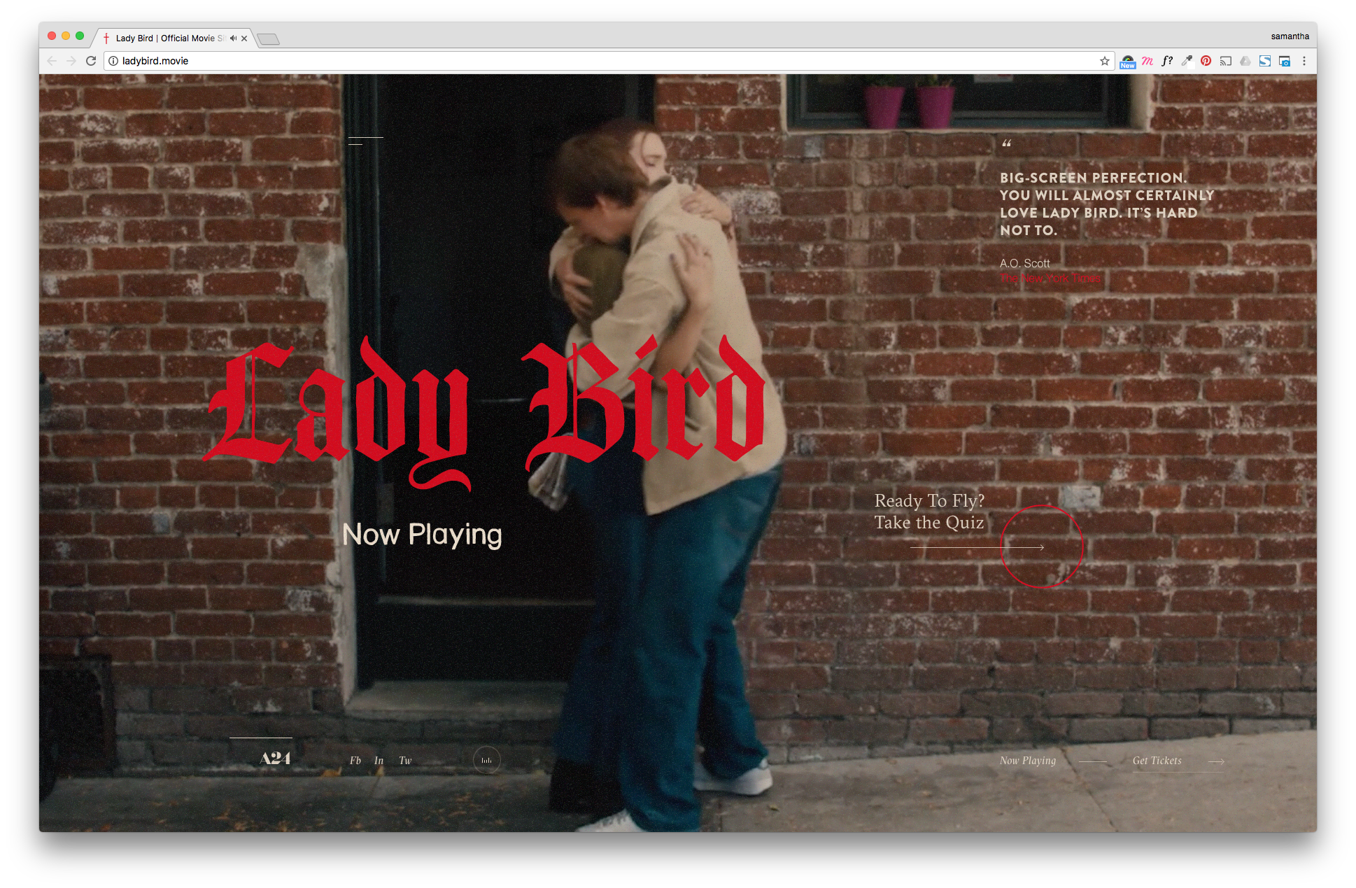
Ladybird.movie
I’m going to keep it short and sweet. My pick is the promotional website for one of A24’s newest films, Ladybird. This site proves that less is more. The microsite focuses heavily on typography, imagery, and animations to provide a rich user experience. The eclectic storytelling of the film translates to the web in the form of a tinder-esque quiz, showcasing film clips as the user swipes left and right to get their result.
The most amazing part of the site? Showcasing that tasteful background music may once again have a place on the web in 2017. Check this out to see how promotional sites should be done, and to get a sneak peek at a potential Best Picture contender.
So there you have it, the General Public roundup of sites that either brought something new to the table, meant something to us personally, or some combination of the two. Based on the trends we’ve seen this year, we’re psyched to see what the next one has in store. We know one thing for sure, our goal will be to make it even harder to not include our own sites on this list next December. We’ll see you in 2018.
Love, General Public.
