Serifs Are Cool Again… and other design trends you need to get over.
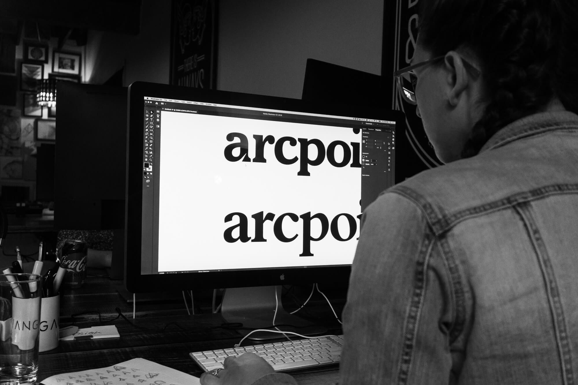
Serif typefaces are BACK – what? They are new they are trendy and they are… bold? Seriously, they are chunky and curvy and thick as hell, and we love them. I’m not talking about Baskerville or Caslon (but tbh they could still get it) I’m talking about the new little weirdos on the block – looking at you Recoleta, Saol, Tiempos, and even Cooper.

These typefaces are making a comeback in a major way. Not all brands are biting on them just yet, and we’ve seen internally here at General Public that clients still prefer to lean on the comfort of a minimalist sans serif, but more and more you see major brands adopting the trend (i.e. Chobani and Buffy).

While these typefaces certainly provide a comforting nostalgic feel, they are also far more expressive, providing designers with a more dynamic outlet to communicate the distinctive voice of a brand. Especially in comparison to the sans serif heroes of major industries like healthcare and tech (looking at you Gotham), these serif typefaces feel warmer, more approachable, and more human. Designers are experimenting more with them and as the world becomes increasingly sick of seeing the same all caps black sans serif logo over and over again, you can expect to see a swing back toward these beautiful curvy little babies.

Other design trends you’re going to see a lot more of (and probably already have):
1) Duotone and Complex Gradients
Remember when gradients were really really bad and made designers want to vomit but somehow any ding-dong with PowerPoint thought they were really cool? Well, turns out they are and last year we finally figured out how to use them.

Duotone gradients specifically are all the rage (they are harder to screw up and you can overlay them on pictures), but more complex gradients are also on the rise, especially in illustration. The trick is to blend the colors well, and not switch drastically between values. When done well gradients can create movement and tell a story that flat colors simply cannot.

2) Drop Shadows
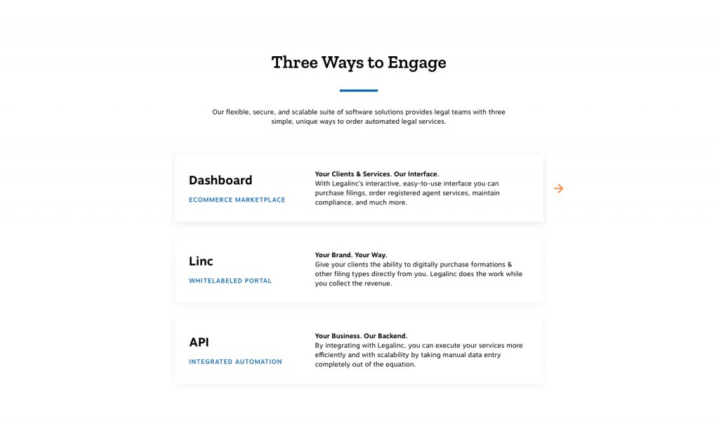
Again, we can thank PowerPoint for first introducing us to the worst version of this little detail – it turns out that a drop shadow doesn’t need to look like a literal shadow! They can be used to create compelling layers and separate the elements of design without harsh lines – who knew?!

3) Broken Grid Layouts
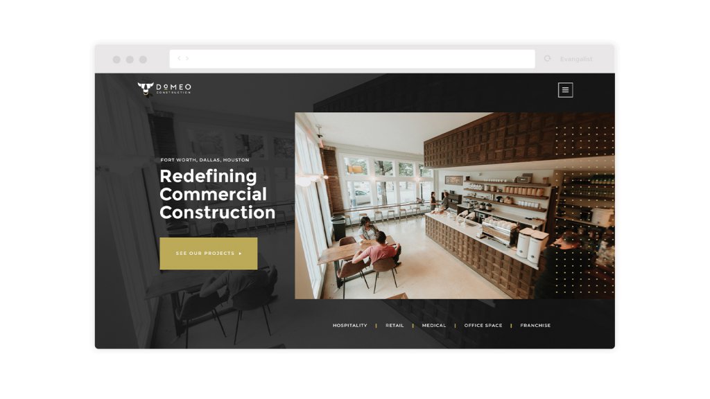
Get ready to re-learn the internet because everyone is breaking the grid. This design trend is one that I hope we proceed toward with caution because the usability of a design should always be the first goal, and while breaking the grid can be visually stunning, we need to maintain the integrity of functionality.
I could probably pick a million other little trends that are rising from the ashes of powerpoint and finding themselves prominently placed as the hero of every trendy designers’ Dribbble account, but lets stick to the basics for now and not get ahead of ourselves. Heck, if we can wrangle drop shadows and gradients and make them into beautiful little monsters, then watch out 2019 – there’s nothing a good designer can’t do.
