Which Comes First In Website Creation: Copy or Design?
Designing the pages of a website first gives the designer ultimate freedom and provides the copywriter with some clear guidelines to work within. On the other hand, the designer is inherently less in tune with what the content of a page should be and how it should be structured, so it’s very easy for a copywriter to have no avenue to convey pieces of messaging.
So, copy should come first then, right? Well, not so fast. While leading with copy ensures that the proper message and messaging hierarchy are established, this direction forces the copywriter to make layout decisions regarding line-length, headline structure, CTA locations, and much more. This can easily limit the creativity of a designer and lead to many web projects with different messaging looking unintentionally similar.
Well, crap. We’ve now talked ourselves out of both options. Truthfully, as with most things in life, the best possible option exists somewhere between the polar extremes. At General Public, we’ve taken every possible approach to answering the copy vs design question, and we’re happy to share our findings with you. After explaining our strategy at a high level, you’ll hear directly from both our copywriter and designer to learn why this system works well for them.
Okay, we won’t keep you in suspense any longer.
As an agency that leads with story, you’ll be unsurprised to learn that we (for the most part) write copy first and design around it. But, and this is a big but, the approach only works because of two things: collaboration between writer & designer, and a fluid creative process.
Jon, our copywriter, is here to speak more to what those two important items mean in practice, then Sam, our designer, will chime it to talk about designing around copy without being limited by the copy.
Jon – Copywriter
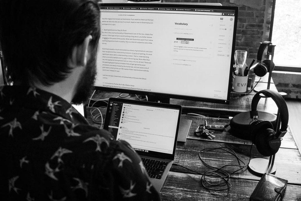
Hey, it’s your friendly neighborhood copywriter here. As a writer, I almost wish that design came first. Starting with a blank page and no parameters can be too much freedom on many projects and can make getting started a huge challenge. But what’s been proven to me is that to say precisely what a brand needs to say through the website, writers must have this freedom. Otherwise, at some point, there will be a square message block that won’t fit into a round design hole. This is where that collaboration and fluidity of process comes in.
Collaboration has kind of become a corny buzzword, so I’ll explain what we mean by that. For me to write successfully, Sam and I have to be on the same page in terms of a loose creative direction and in terms of sitemap. I also routinely bug her with layout questions when writing, as opposed to just writing copy docs without a care in the world. Digital collaboration is equally important, so Round 1 copy docs are often filled with in-line comments, questions, and suggestions that help Sam understand why I’m structuring content the way I am.
Fluidity of process is a fancy phrase meaning that Sam and I have an understanding that while the copy I’m writing should not be edited, the formatting is much less concrete. When the copy is in Sam’s hands for design, she will ask me questions about structure, ask if I can make a slight edit to accommodate her design, or even ask if I can write additional sections to flesh out the look of a page. Fluidity here really just means that I know when I hand over the copy docs, I’m not actually done writing. And Sam knows that when she presents design internally, she’s not actually done designing. It’s that mutual understanding that what we’re creating is a living, breathing organism that allows us to stay true to our mission and lead with brand stories.
Sam – Designer
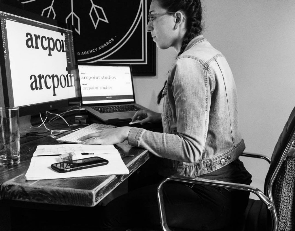
I’ll start out by saying “lol” that Jon wishes design came first because it feels like the world’s best golf handicap (alt: cheat code) to receive copy before design. Plus, as an extra bonus, the way that Jon writes copy, it’s already sort of a wireframe in text form – so I feel like I’m cheating – but great partnerships are called great because they help each other’s job easier, right?
Jon’s also right that we do enough collab-convos upfront. Through our series of kick-off/strategy meetings we have early on, we both have a general understanding from the start of how pages should look from both from a content and layout perspective. This doesn’t mean that there isn’t room for creativity or even *loud gasp* major changes to the initial plan. Like Jon mentioned, sometimes I can be a pain in his side after he has done so much heavy lifting with the content by asking for extra copy, less copy, or shorter/longer headlines because of the design structure that works best for the client, best reflects their inspiration sites, and best supports the ideal user flow.
Sometimes, after clients have seen the first round of copy in the initial wireframe, they realize that they want to lead with a different part of their brand or they give us some context we didn’t previously have. People tend to be very visual, so seeing the copy in the context of design reshapes their perception of it. In this situation, I’ve taken it one step further from the Sam & Jon collaborative process and have added the client’s critique as well. The copy & design relationship is really a juggling act with our third partner: the client.
All in all, it works best for us to lead with messaging and make it sexy, rather than lead with design and try to shoe-horn the message into it. It serves the client best, helps them see their brand voice in action, and allows us to make changes based on the story we are telling, not just based on what looks good.
The caveat to this entire conversation is that there are still times when we choose to design first. Those instances are pretty limited, but the beauty of clear processes is that you can comfortably augment them when you need to. For instance, when a client is happy with their existing message for the most part and is really turning to us for a design update, we may design first. More commonly, when we’re in a sprint because a client needs a landing page or microsite extremely quickly, we may actually design & develop the pages before writing a word of copy.
The message of this blog is that we believe to truly lead with story, you have to lead with copy. But the reason you have rules like that is so you only break them with a purpose. Copy and design have to have a symbiotic relationship to create something with stopping power and something that truly lasts.


